
Analyzing open data about crime in Philadelphia
Using some techniques from cosmological analyses
In the past decade, many cities in the US and around the world have established online portals to make city data available to the public. This open data practice makes it easier for people to obtain information about government activity in their cities, to understand them better, and even to propose changes based on those data. In this post, we will describe the analysis of a data set made public by the City of Philadelphia, through their webpage opendataphilly.org.
Using street light poles to map the city
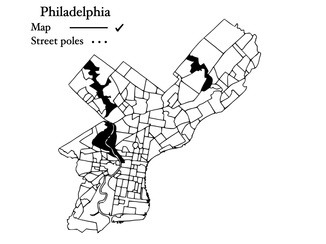
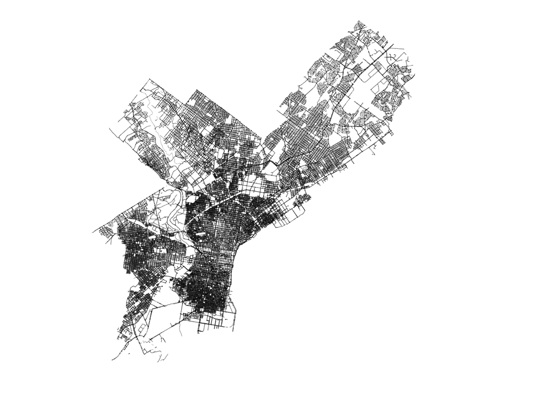
Before starting with any particular data set, we are interested in the mapping of the city, in order to visualize the data. However, in python, using the standard libraries I use for data analysis in astrophysics and cosmology, I do not know how to draw a map of a city. So I considered alternatives to this. In cosmology, we also are interested in maps (of the Universe!). And we use galaxies as tracers, because we can see the light they emit. Is there something equivalent for a city?
Perhaps we could use street light poles to trace the city!
In this way, I found the data set corresponding to light poles in Philadelphia, and the image below shows a comparison of an image map of the city, as thick black lines, and the plotting of every single light pole in the city, each represented by a small black dot. We can see that the light poles are good tracers of the city, similar to galaxies in our Universe!
The mapping of light poles is made using this simple python code:
import numpy as np
import matplotlib.pyplot as plt
%matplotlib inline
import pandas as pd

data_poles = pd.read_csv('Street_Poles.csv')
X_poles = data_poles['X'].values
Y_poles = data_poles['Y'].values

plt.figure(figsize=(20,20))
plt.scatter(X_poles,Y_poles,0.1,c='k')
plt.xlim(-75.3,-74.9)
plt.ylim(39.85,40.15)
plt.axis('off')
Crime data
In this post we will analyze public crime data from the city of Philadelphia. The data set contains information on Part I and II crimes starting on 2006. But what are Part I and II crimes?
For reporting purposes, criminal offenses are divided into two major groups: Part I and Part II offenses. Part I offenses are the most serious crimes (homicide, rape, etc), while Part II offenses contain crimes such as theft, vandalism, public drunkenness, etc. The full list of crimes we have data for is: Homicide, Aggravated Assault, Rape, Public Drunkenness, Drug Law Violations, Prostitution, Disorderly Conduct, Fraud, Vandalism, Robbery, Burglary and Theft.
DISCLAIMER All the data in this post comes directly from the City of Philadelphia and its Police Department, and hence it is not free of racial and other biases that are present in those institutions.
We will label these different categories as:
# Grouping crimes
crimes_names = ['Homicide', 'Aggravated', 'Rape', 'Drunkenness', 'Narcotic', 'Prostitution', 'Conduct', 'Fraud', 'Vandalism', 'Robbery', 'Burglary', 'Theft']
crimes_labels = ['Homicide', 'Aggravated Assault', 'Rape', 'Public Drunkenness', 'Drug Law Violations', 'Prostitution','Disorderly Conduct', 'Fraud', 'Vandalism','Robbery','Burglary','Theft']
Now let’s go over the data for different crimes. We will start by plotting the locations of the different crime entries on the map and use a kernel density estimation (KDE) (KDE) for visualization. We will do this for different crimes trying to get some insights on their distribution in the city. Later on, we will look at the evolution of different crimes throught the years, and also at the spatial correlations between different crimes.
For the visualization and the KDE, we use the code below.
from sklearn.neighbors import KernelDensity

for k in range(len(crimes_names)):
    # Loading the data set
    data_crime = pd.read_csv('incidents_part1_part2_2000-2020.csv')
    mask_area = ((data_crime['point_x'].values>-75.3)&(data_crime['point_x'].values<-74.9)&(data_crime['point_y'].values>39.85)&(data_crime['point_y'].values<40.15))
    data_crime = data_crime[mask_area]

    #Filtering it by crime
    count = 0
    hom = np.zeros(len(data_crime['text_general_code'].values))
    for i,c in enumerate(data_crime['text_general_code'].values):
        if crimes_names[k] in c:
            count +=1
            hom[i] = 1

    data_crime = data_crime[hom==1]

    max_points = 20000.

    if count >max_points:
        r = np.random.rand(count)
        data_crime = data_crime[r<(max_points/count)]
        print len(data_crime)


    X_crime = data_crime['point_x'].values
    Y_crime = data_crime['point_y'].values
    XY_crime = np.zeros((len(X_crime),2))
    XY_crime[:,0] = X_crime
    XY_crime[:,1] = Y_crime

    #Setting the KDE
    xbins=500j
    ybins=500j
    bandwidth = 0.001


    x = X_poles
    y = Y_poles

    xx, yy = np.mgrid[x.min():x.max():xbins,y.min():y.max():ybins]

    xy_sample = np.vstack([yy.ravel(), xx.ravel()]).T
    xy_train  = np.vstack([Y_crime, X_crime]).T

    kde_skl = KernelDensity(bandwidth=bandwidth)
    kde_skl.fit(xy_train)

    # score_samples() returns the log-likelihood of the samples
    z = np.exp(kde_skl.score_samples(xy_sample))
    zz = np.reshape(z, xx.shape)

    xy_crime  = np.vstack([Y_crime, X_crime]).T
    z_crime = np.exp(kde_skl.score_samples(xy_crime))

    plt.figure(figsize=(20,20))
    plt.scatter(X_poles,Y_poles,0.1,c='k',alpha=0.6)
    plt.scatter(X_crime,Y_crime,7,c=(z_crime),cmap='YlOrRd',vmax=np.percentile(z_crime,95))
    plt.xlim(-75.3,-74.9)
    plt.ylim(39.85,40.15)
    plt.axis('off')
    plt.text(-75.1,39.95,'%s (2006-2020)'%crimes_labels[k],size=33,color='orangered')
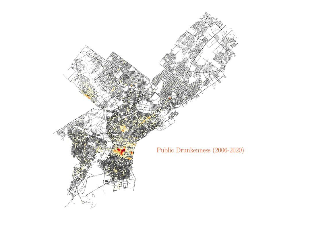
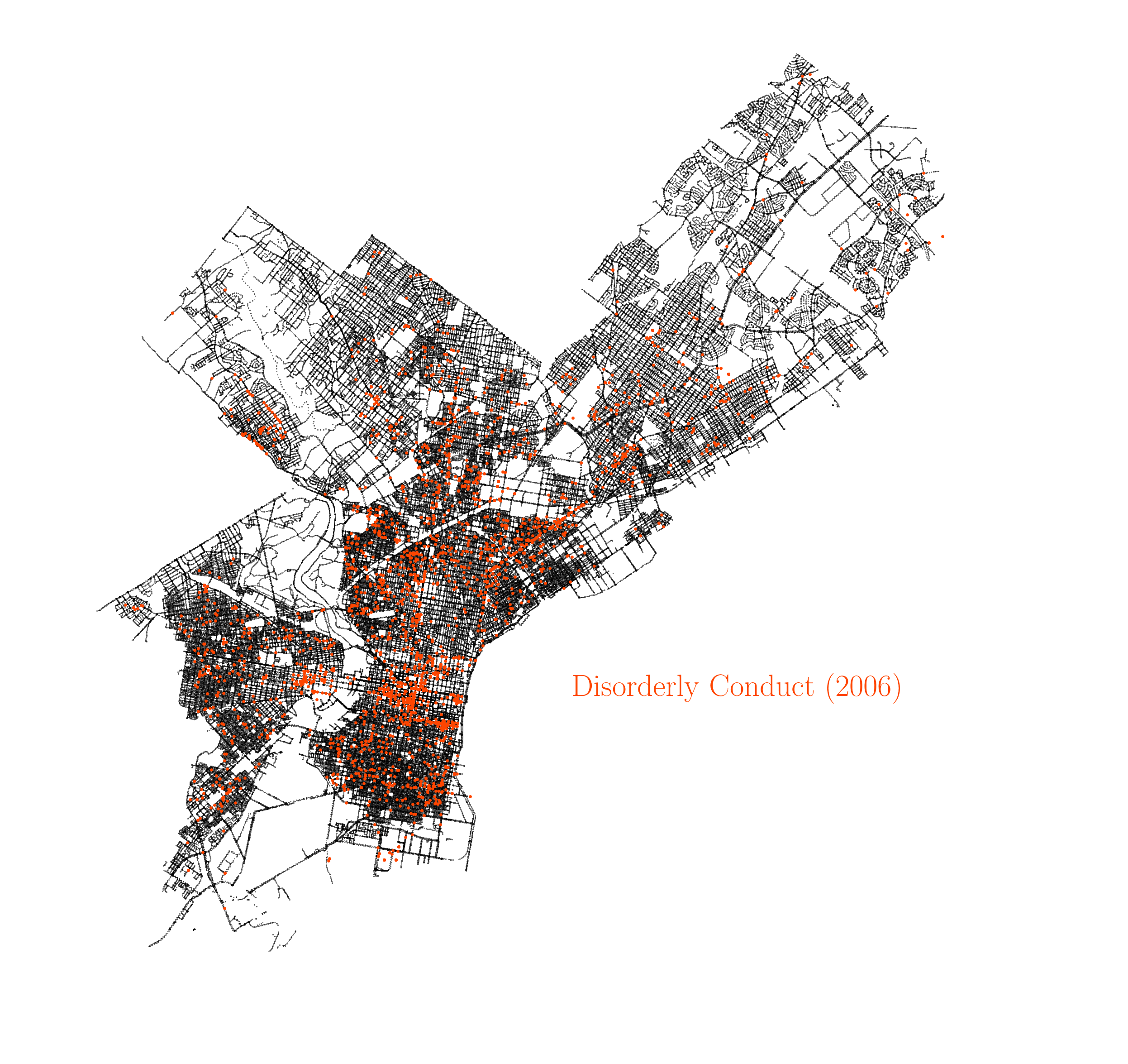
Public drunkness
Let’s start visualizing the resulting image with the crime data for public drunkness occurences, and test if the data makes sense. By looking at the density peaks, we can identify some regions of the city with a higher density of bars and pubs. This is a simple test to check that we understand how to visualize the data.
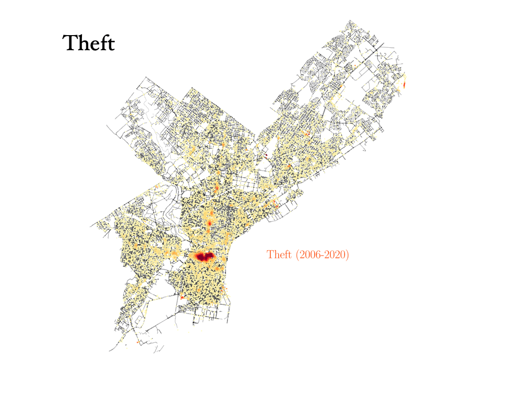
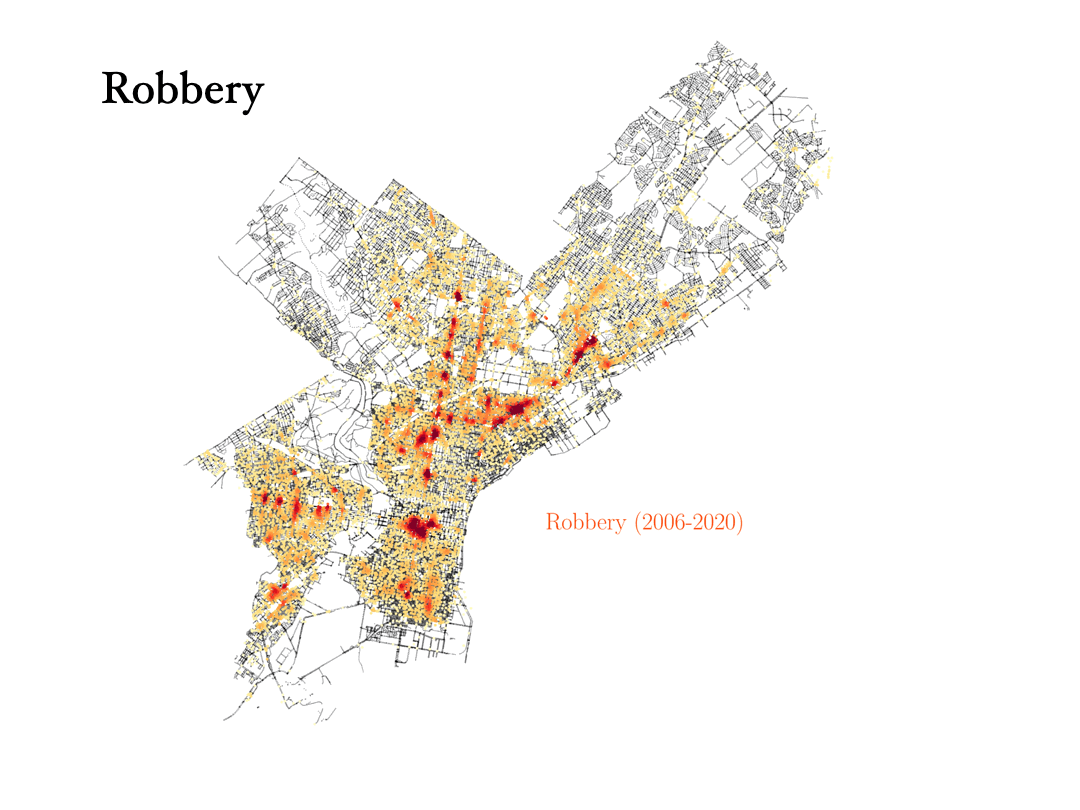
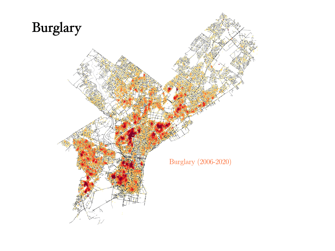
Theft, robbery and burglary
Now we will analyze the data for three crimes that are connected to each other: Theft, robbery and burglary. Can the data tell the difference between them?
- Theft: To commit a theft, you have to take someone else’s property without the owner’s consent and with the intention to permanently deprive the owner of its use or possession. Shoplifting is an example of theft. In Philadelphia, most cases of theft occur around center city, where most shops are, and we can also identify some big malls.
- Robbery: Theft is taking something that doesn’t belong to you, but a robbery is taking something from a person and using force, or the threat of force, to do it. In the data, we can see how the robbery data are tracing the train stations in the city, with most robberies happening outside those stations.
- Burglary: To commit a burglary you must enter a structure or dwelling with the intent to commit a crime within it. For this reason, burglaries are more spread out in the city, and they happen in similar places as vandalism, for instance.
Analyzing the data on Prostitution
Now we will consider the data for the crime corresponding to prostitution in the city of Philadelphia. This is probably the case that surprised me the most, and it took me some time and research to understand what the data was showing. The visualization shows that most cases of prostitution in the city are happening in the same area, mostly just in one street.
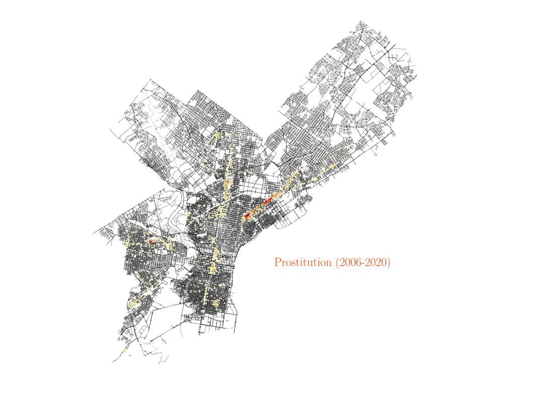
For a European person like me that might seem at the beginning as the data is just highlighting some sort of red-light district of the city. However, that is not the case. That one particular street in Philadelphia where most of the prositution charges occur is no other than Kensington Avenue, which happens to be one of the largest open-air narcotics market for heroin on the East Coast. After some research about the neighborhood, I found an article by Jennifer Percy in The New York Times Magazine, titled Trapped by the ‘Walmart of Heroin’. The article describes in detail the many ways people get stranded in the neighborhood due to drug addiction, and how they continue to pay for drugs even when they have no job. In particular, the article describes how, after years of deep addiction, many women end up as prostitutes, offering sex services to pay for the drugs they need. The data shows how these examples are not isolated. Actually, the Kensington area, with only less than 5% of the area in Philadelphia, is responsible for more than 50% of the prostitution charges in the city. And given how underpoliced the area is, those numbers may actually be higher in reality. Furthermore, if we look at the distribution of drug charges in the city, they will also be most prominent around the Kensington region.

Assault, rape and homicide
Finnaly, below we show the distribution of assault, rape and homicide crimes in Philadelphia, which are more spread around the city and trace similar areas in all three cases.
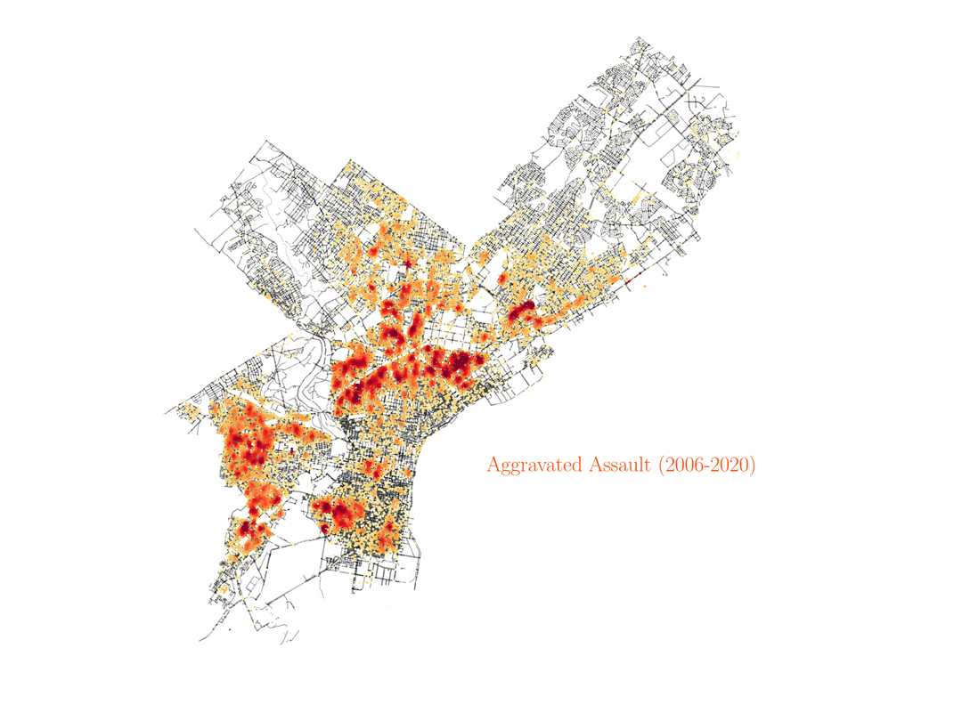
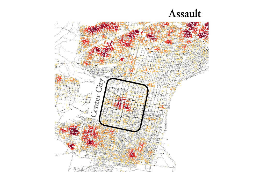
We see that homicide, aggravated assault and rape are very spatially correlated across the city. However, not everywhere, especially not in center city, as you can see below. And by the way, the KDE color scale is set differently for each case, so if center city is showing red colors in assault and rape it would also have to show similar colors for homicide, even if the number of events was lower overall (colors show the crime density). This shows how certain crimes like assault, rape and homicide can happen broadly accross the same regions in the city, but then homicide shows different distributions in specific areas of town, especially center city.
Trends with time
Now, having explored the distribution of various crimes throughout the city, we move to explore how the number of different crimes has changed over the years for which we have data from the city (2006 - 2020). This information is included in the plot below:
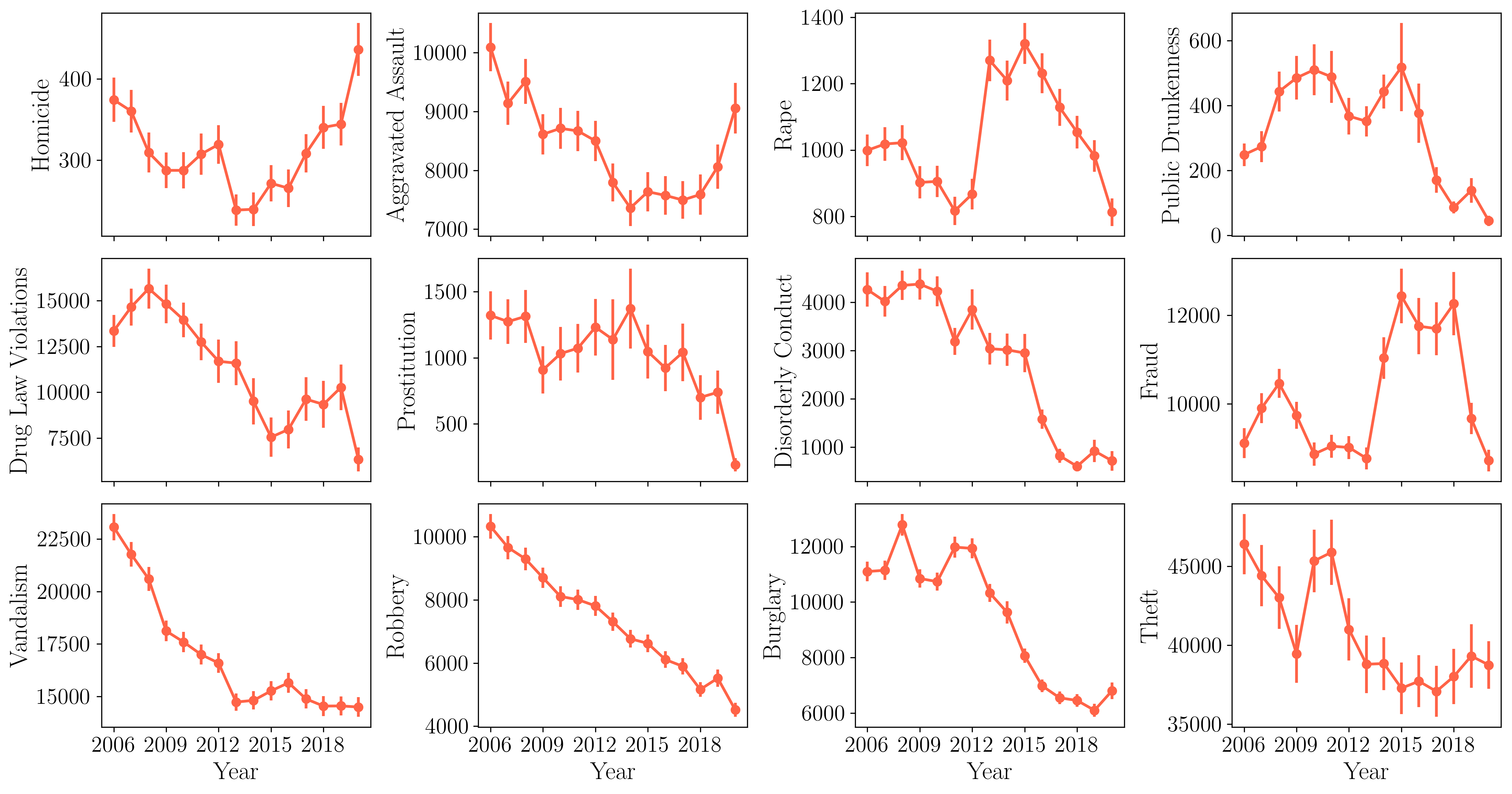
There are several things worth noting here. We all know that last year in that time series, 2020, was a very special year due to the COVID-19 pandemic, and that uniqueness is reflected in several ways in the plot. The 2020 year records the biggest year-to-year increase in homicides since there is available data, and the same happens for aggravated assault, showcasing the impact of the pandemic in increasing severe violence in the city. This has also been the case in other major cities in the US, as reported by this article in The New York Times. On the other hand, many other crimes recorded big drops during 2020, with many of them reporting the biggest year-to-year drops since 2006, in particular drug violations, prostitution and rape. Many crimes are also on their lowest rates since 2006, like drug violations, prostitution, rape, public drunkness and robbery. It is also worth noting how the incidence of some crimes have been falling over the years. For instance, the animation below shows the occurences of disorderly conduct over the years.
Spatial correlation between crimes
As a technical note, you may have wondered how we added error bars to the plot showing the trends of different crimes with time. Those are estimated using a statistical technique to obtain uncertainties called jackknife resampling (JK). With this technique, we can estimate a parameter and its uncertainty by systematically leaving out each observation (or group of observations) from a dataset and calculating the estimate and then finding the average and dispersion of these calculations. This technique is widely used in the analysis of cosmological galaxy surveys, where the different JK regions correspond to different patches of the sky (for instance, see this article).
For the data analysis of the city of Philadelphia, we have jackknifed the city into different small regions, each of them being a JK sample. We do this by using the k-means algorithm applied to the set of light poles in the city, that we described earlier. This is another advantage to using the set of street poles in the city, as it provides us with a fairly uniform sampling of the city area that we can use to construct the JK regiones using the k-means algorithm. The resulting separation into JK regions is shown below.
The python code to produce these regions from our data for light poles is here:
from sklearn.cluster import KMeans, MiniBatchKMeans

XY_poles = np.zeros((len(X_poles),2))
XY_poles[:,0] = X_poles
XY_poles[:,1] = Y_poles

kmeans = MiniBatchKMeans(n_clusters=500, random_state=0).fit(XY_poles)
region_poles = kmeans.labels_
centers = kmeans.cluster_centers_

plt.figure(figsize=(20,20))
plt.scatter(X_poles,Y_poles,2,c=region_poles,cmap='Spectral',alpha=1)
plt.xlim(-75.3,-74.9)
plt.ylim(39.85,40.15)
plt.axis('off')
And the code to produce the plot of crime trends with year, including JK error bars, is here:
years = np.arange(2006,2021)

counts_crimes_region_year = np.zeros((len(crimes_names),len(years),500))

for y,year in enumerate(years):
    for k in range(len(crimes_names)):

        # Loading the data set
        data_crime = pd.read_csv('../../Data/Philly_crime/incidents_part1_part2_%d.csv'%year)
        mask_area = ((data_crime['point_x'].values>-75.3)&(data_crime['point_x'].values<-74.9)&(data_crime['point_y'].values>39.85)&(data_crime['point_y'].values<40.15))
        data_crime = data_crime[mask_area]

        #Filtering it by crime
        count = 0
        hom = np.zeros(len(data_crime['text_general_code'].values))
        for i,c in enumerate(data_crime['text_general_code'].values):
            if crimes_names[k] in c:
                count +=1
                hom[i] = 1

        data_crime = data_crime[hom==1]

        X_crime = data_crime['point_x'].values
        Y_crime = data_crime['point_y'].values
        XY_crime = np.zeros((len(X_crime),2))
        XY_crime[:,0] = X_crime
        XY_crime[:,1] = Y_crime

        region_crime = kmeans.predict(XY_crime)

        counts_crimes_region_year[k,y] = np.bincount(region_crime,minlength=500)


fig, ax = plt.subplots(3,4,figsize=(15,8),sharex='all')
fig.tight_layout()
plt.subplots_adjust(wspace=0.4, hspace=0.1)

count = 0
for i in range(3):
    for j in range(4):
        ax[i,j].errorbar(years,np.mean(counts_crimes_region_year_jk,axis=2)[count],np.sqrt(njk-1)*np.std(counts_crimes_region_year_jk,axis=2)[count],color=colors[4],lw=2,fmt='o-')
        ax[i,j].set_ylabel('%s'%crimes_labels[count],size=18)
        ax[-1,j].set_xlabel('Year',size=18)
        ax[i,j].set_xticks([2006,2009,2012,2015,2018])
        count+=1
ax[0,0].legend(loc=4,fontsize=11,frameon=False)
There is one other advantage to setting up the JK method on Philadelphia crime data: Now we have spatially split the city into small regiones and therefore we can estimate the spatial correlation between different crimes in the city (the color scale sets the correlation coefficient, defined between zero and one in the plot).
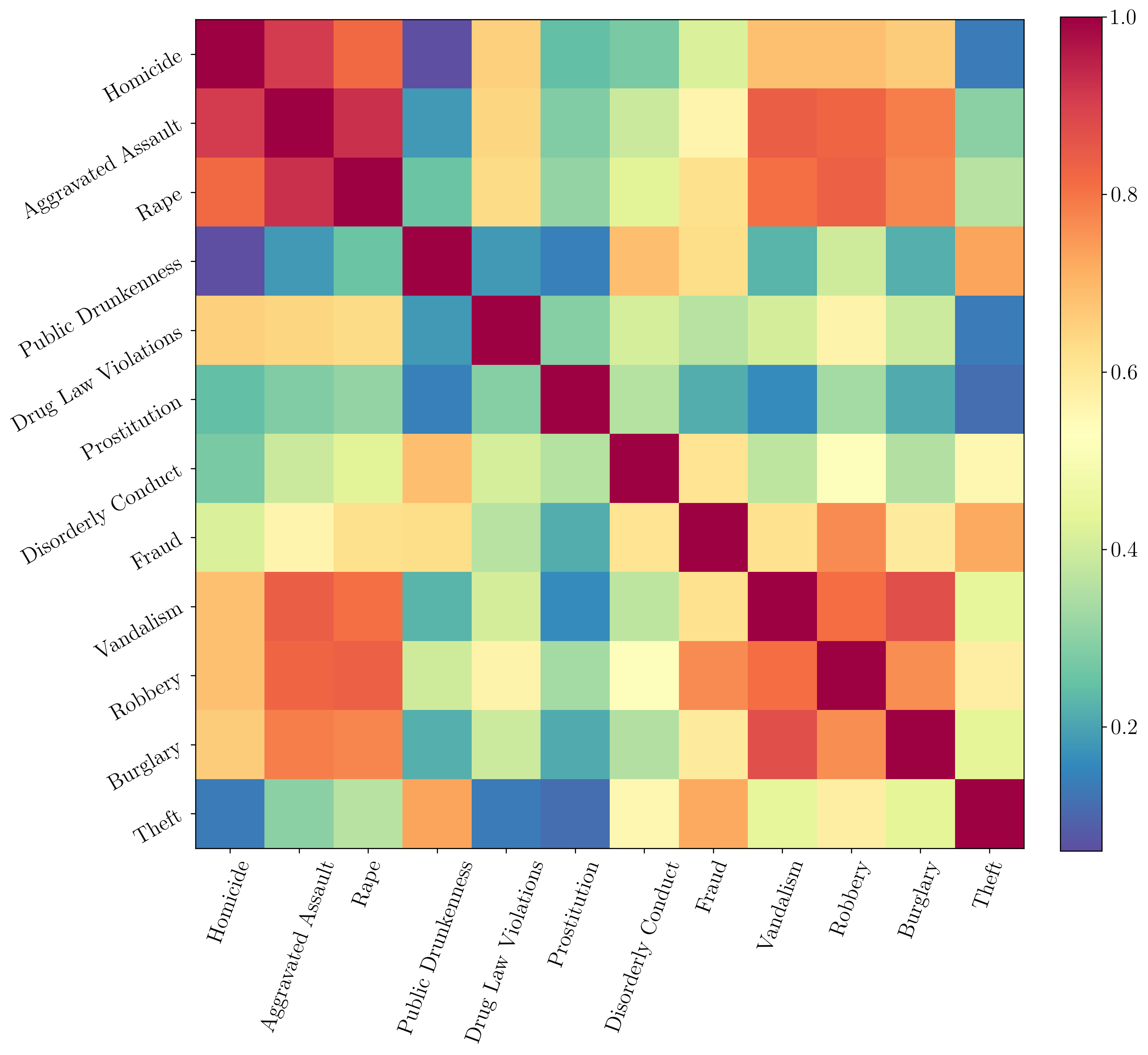
We can see how homicide, assault and rape are very spatially correlated, although we saw that the correlation did not hold in center city, where the number of homicides was much lower compared to the other two crimes. The code to make this correlation matrix using the JK resampling is here:
fig, ax = plt.subplots(figsize=(12,12))
im = ax.imshow(np.corrcoef(np.sum(counts_crimes_region_year_jk,axis=1)),cmap='Spectral_r')
fig.colorbar(im, ax=ax,fraction=0.046, pad=0.04)
ax.set_xticks(range(len(crimes_labels)))
ax.set_xticklabels(crimes_labels, rotation=70)
ax.set_yticks(range(len(crimes_labels)))
ax.set_yticklabels(crimes_labels, rotation=30)
Final thoughts
For a future analysis, it would be interesting to include some non-crime data, and analyze how crimes correlate with other different data sets. It would also be interesting to analyze how policing the city works, what is the distribution of random stops, where in the city do crimes get more prosecuted and such, and get racial data for crimes (which is not included in this dataset). If someone is interested in discussing any of these results or has ideas for some collaboration or related work, please feel free to contact me.
Ever since I started my PhD in Physics back in Barcelona, and now as a postdoctoral researcher in Physics & Astronomy at the University of Pennsylvania, I have always worked with data. The data is typically about hundreds of millions of galaxies in the Universe, and the work is on analyzing them, learning how they shape our model for the Universe, using statistical techniques that are often complicated but sometimes can be rather simple.
When I’m not working, one of the things I enjoy the most is journalism. Lately, I’ve been interested in a discipline called data journalism. That doesn’t mean I prefer that type of journalism over others, not at all, just that it’s closer to what I do and hence I feel more tempted to try it. Also, as it happens as well in astronomy, there is now a huge amount of data being made public, so that anyone can analyze it. So that was the idea behind this work, analyzing city data using some techniques we use in cosmological analyses.